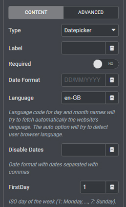
Datepicker Field

The Datepicker field adds a fully-functional calendar feature for picking days, months, and years to your Elementor forms.

watch the Datepicker Field tutorial

Add even more information to your forms with the useful Datepicker Field.

The Datepicker Field, once toggled on in your Gloo Dashboard and selected as a field for your Elementor Form, will add an extremely customizable calendar from which your users will be able to submit, and even save, their chosen dates.

Everything will be formatted in your choice date format and language for day and month names.

Customizable to fit your needs.

Along with the standard settings like the field’s label, you’ll notice that the Datepicker Field has customizable entries like dates to be disabled  (for example holidays when your service isn’t available) and even which day will be regarded the first day of the week by the calendar.

You can set the calendar to close as soon as the date or ranges of dates are picked, or even simply hide it on click.

By toggling on the Dropdowns option, your user will be able to click directly on the month and years and pick their choice from the dropdown menus that will appear on click.

Integration with Frontend Post Submission and Editing.

You will now find new toggles in the settings section for two other SuperGloo Addons features, Frontend Post Submission and Frontend Post Editing.

In the Meta Field section of the settings for these two Actions After Submit, toggle “Datepicker Field?” on if the field is enabled in the form, and you can then choose to store the date from the field in the database as an UNIX timestamp rather than direct date format. This way, the submitted date can be used as a filter in the future.

Frequently Asked Questions

The Datepicker Field is a customizable calendar feature in Gloo that can be added to Elementor Forms, allowing users to submit and save their chosen dates in a specific date format and language.
In addition to standard settings like the field’s label, the Datepicker Field has customizable entries such as dates to be disabled (such as holidays), and which day will be regarded the first day of the week by the calendar.
Yes, the Datepicker Field can be set to close as soon as a date or range of dates is picked, or even simply hide on click.
THIS FEATURE IS PART OF :
Gloo logo - white

Datepicker Field

Forms + Extension - header

Let your users submit days, months and years with ease.

Add a new form - choose datepicker form field - customize.
Datepicker field selection
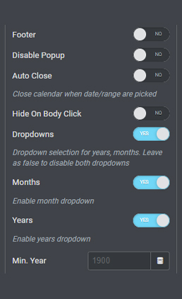
dropdown selection, disable dates, and more.
Enjoy wide customization options in this field. Disable entire dates, set the starting day of the week, select dropdown menus for either days, months, or both, set the calendar to close once the date has been chosen, and more options to get the UX right.

More Modules

Bundle Maker Widget New
GSAP Line Drawing
Globals Dynamic Tag
Zoho CRM Form Action
3D Model Widget
GTM DataLayer Form Action
Autocomplete Address Fields
Frontend User Registration New
Custom DB Value Dynamic Tag New
Save Cookies Form Action New
BuddyBoss Friendship Status Dynamic Tag
Terms Field
Salesforce CRM Form Action
Woo Variation Table New
Repeater Dynamic Tag
GTM DataLayer Connector New
Random String Dynamic Tag New
Frontend Post Submission
Slider Power New
JetEngine Dynamic Visibility: BuddyPress Addon New