
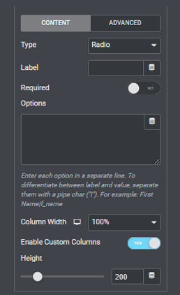
The Radio and Checkbox Form Fields are extremely useful ways to present multiple choices from which your users can select from and then submit through your Elementor Forms.
However, by default, there are not many ways to make every subsequent option look stylish or particularly pleasant to the eye, and as such both the UI and UX always suffer from the lack of customizable options.
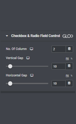
Checkbox & Radio Field Control allows you to arrange your selection options into neat, separated columns and rows, improving the UI and the general presentation of the form.
Once the content for your Radio or Checkbox fields are set, and once the Enable Custom Columns option is toggled on, you can head on over to the Style Tab to discover a section dedicated to this feature. There you will be able to set the number of columns, the Vertical Gap between the rows, and the Horizontal Gap between the columns themselves.
A simple yet handy feature that will donate a more professional look to your Elementor Forms.


Looking for a lifetime deal?