
Slider Power is here! Have your clients ever asked you to turn a certain section into a slider, along with all the widgets and elements contained within? It’s quite the common request that to date doesn’t have a simple, elegant and powerful solution that won’t require hefty development time, needing to charge the client more and possibly losing them in the process, as it sounds like a reasonable and quick request to the uninitiated, only to be faced with ulterior often large costs.
This, along with many other use cases, are now complete non-issues thanks to Gloo’s Slider Power, Power Gloo‘s solution to create extremely customizable sliders that contain any amount of Elementor widgets, containers and any element you are already used to working with. You can even nest sliders within sliders!
The real strength of Slider Power lies in how intuitive it is to prepare the layout. It’s as simple as it can be: create a master container, and as many containers inside of it as you want. By toggling on Slider Power in the master container that contains all others, the containers inside will become the slides for your sliders. You will find the Slider Power toggle in its own submenu in the Layout tab of the container settings.
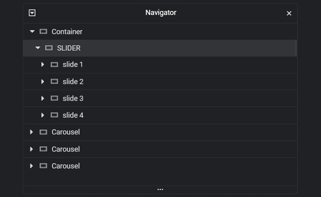
You can then design each section within as you would any other Elementor section, and everything within each container will slide away as a whole according to the selected effect.
With all our slides designed, it’s time to define the slider behavior itself. We can do this in the Effects drop down menu. Each effect that can be selected except the most basic Slide effects comes with its own settings called Effect Parameters. These settings change from effect to effect and will let you customize every single parameter available for those effects. The available effects are:
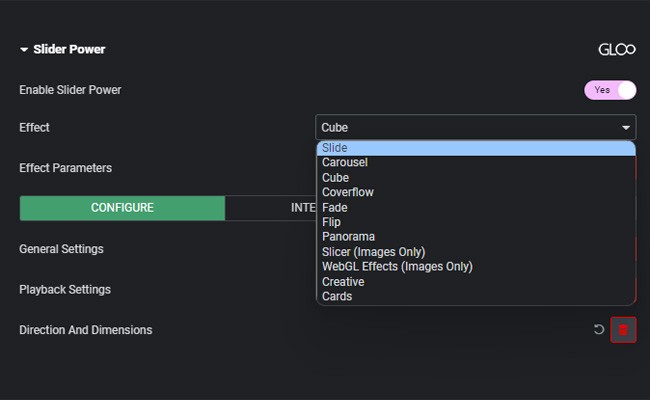
Basic Slide effect. No further parameters to set up for this one.
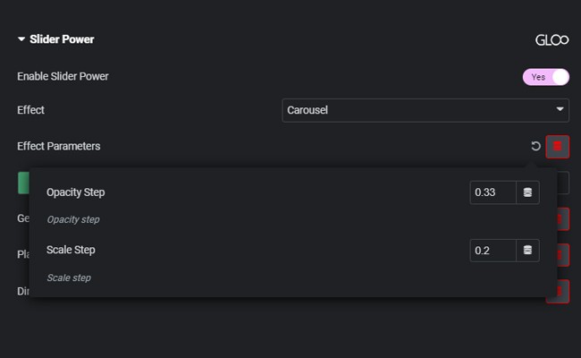
Classic Carousel Effect: the active slide is the largest while transitioning from one to the other reduces scale and opacity. We can change the amount both change by in the Effect Parameters.
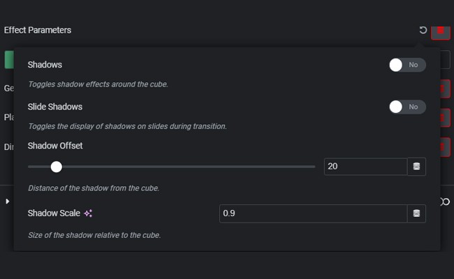
Creates the illusion of slides being the different faces of a cube. We can make the illusion stronger by giving the whole cube a shadow, or doing the same just for the slides during transition.
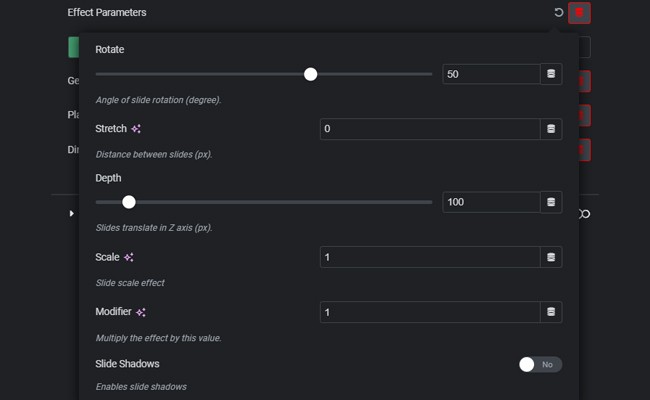
The Coverflow effect is similar to the classic Carousel, but (at its most basic) with the slides covering and flowing over each other in depth as well, hence the name. We can however, using Effect Parameters, also rotate, stretch, change the depth, scale, and give the slides a shadow.
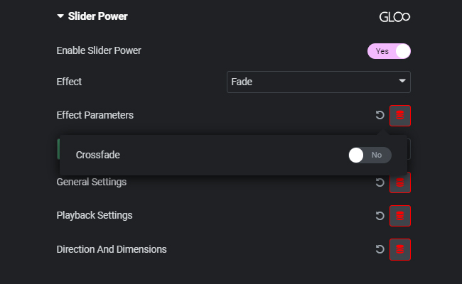
Simple Fade transition between slides. We can fade out or choose to crossfade by toggling on the related option in the Effect Parameters.
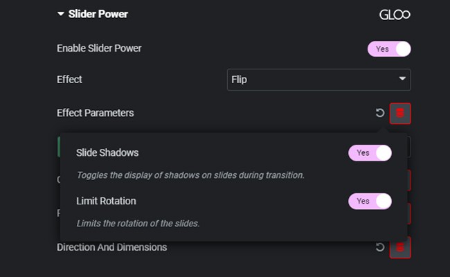
Flips one slide into the next. We can toggle on shadows for the slides and limit the rotation should it prove too aggressive.
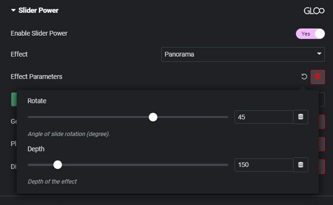
The Panorama effect can be used if we want to show more than one slide at a time while presenting a surround effect, with the active slide being the smallest at the center and the other slides being presented according to the depth and rotation of the parameters, as if the observer were at the center of a circle.
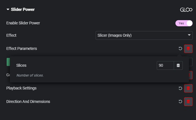
This will slice up the first slide into however many slices are set in the Effect Parameters settings, and will then reveal the second slide as if it were under it. *This will only work on image widgets and not any other element
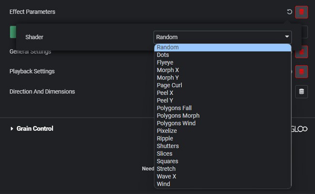
This will let us choose from 19 different and creative WebGL effects to apply to our slider! *This will only work on image widgets and not any other element
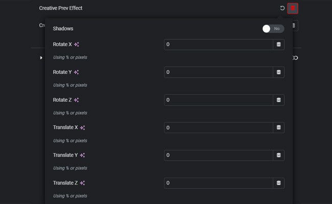
In true Gloo fashion, by selecting this effect you will have full control over the transformations for both previous and next slides, rotation and translations for all three axes, and an option for each slide to cast drop shadows. If we’re working with the Creative effect, we won’t have access to effect parameters, as they’ll be split for more precise control between Previous and Next slide controls, which we can find on the bottom of the Configure Tab.
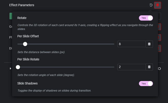
Presents the slides as if they were cards in a deck. In Effect Parameters we will be able to customize the amount of rotation and if they rotate at all, the offset per slide and the rotation per slide, along with the slide shadows.
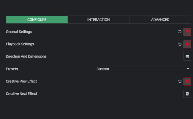
Here we will find the General Settings, which remain mostly unchanged for any given Effect. We can choose how many slides are present at the same time in the Slider wievport with the Slides per View parameter, how many slides to slide with the Slides to Scroll parameter (for example if we want to skip one slide when sliding, we’d write 2. 0 and 1 result in default behavior) and we can define the Space Between Slides.
Furthermore, we can even define the sensitivity of the slider for user interaction like swiping with the mouse or touch controls with the Touch Ratio parameter. Higher values here signify higher sensitivity.
With Slide Speed, we can define the speed of the transition in milliseconds. Centered Slides is especially useful for effects like Carousel, as it will place the active slide always in the center of the view. Last but not least, we have Hide Overflow X and Hide Overflow Y. these will, as the name says, remove the overflow on the X and/or Y axis making sure we won’t have an unsightly horizontal scrollbar if we’re having issues with overflow due to design.
Outside of the General Settings, Playback Settings will let us toggle on autoplay (and the speed of autoplay in milliseconds) and loop for our slider and Direction and Dimensions will let us choose if the slider slides horizontally or vertically, and set a manual container width if needed.
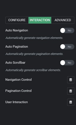
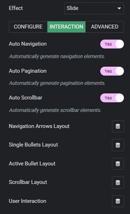
Here we can set up the pagination and navigation methods for our slider. We can toggle on Auto Navigation, Auto Pagination, and/or Auto Scrollbar, which will generate arrows, bullet points, and a scrollbar for navigation and pagination. With all three toggled on, we’ll have the styling options for the arrows, the single bullet, the active bullet (the one that represents the slide we’re on), and the scrollbar layout options.
Toggling Auto Navigation, Auto Pagination and Auto Scrollbar off, Slider Power’s extreme customization options come into play. The four options from earlier will change to just two: Navigation Control and Pagination Control. Opening up Navigation control, we can assign any class to the Next and Previous button functions. This means we can use any widget or element as navigation for our sliders, leaving complete control over the design if we don’t want to be constrained by the automatically generated arrows.
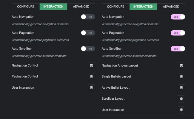
Pagination Control works much the same way, except we won’t be able to use just any widget as pagination, but we’ll have to choose from three of the all-new Gloo Slider Power Widgets:
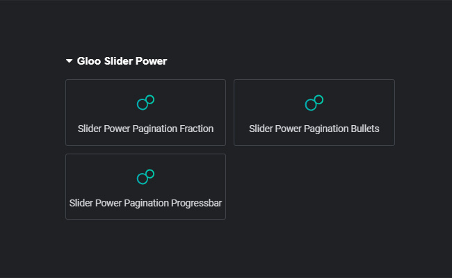
We can place any of these where we need them, then map them back in the Slider Power Pagination Control settings by pasting or typing the class we gave to the chosen widgets we just placed and selecting the matching type in the Type drop-down menu. Of course, each widget comes with an extremely customizable design control in their respective Style tabs. Should we select the Bullets widget, in the Pagination Control settings we’ll be able to make the bullets clickable and dynamic.
Dynamic bullets mean that their size will change according to the number of slides in the slider.
Regardless if we’ve chosen to auto generate navigation and pagination options, User Interaction settings will remain available.
User Interaction will let us choose if the user will be able to control the slider with the directional keys of the keyboard and/or with the mouse wheel.
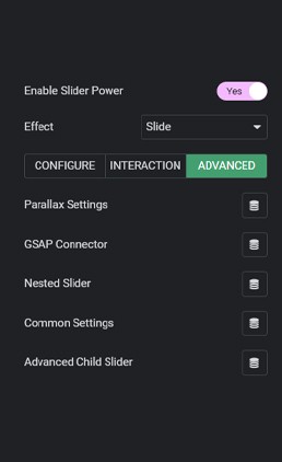
In the Advanced Tab we will find Parallax Settings, GSAP Connector, Nested Slider, Common settings and Advanced Child Slider. Let’s go over them in order:
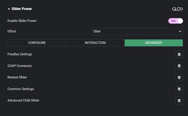
Here, we can enable parallax. An effect which will be achieved by choosing particular HTML Attributes using Gloo’s Dynamic HTML Attributes Repeater inside the widgets we want the particular parallax properties to apply to. More information on parallax can be found here, in the Dynamic HTML Attributes Repeater.
This field allows us to give our slider an unique ID that can be then mapped to GSAP Scrolltrigger‘s new GSAP event: Slider Tween. This will allow us to control the slider via page scrolling rather than navigation.
Toggle this on if this slider we’re building is actually inside a container that will be further used as a slide for a another slider higher in the hierarchy.
Here we can choose if we want to allow the slider to go to the next or previous slide, if we want touch controls to be allowed, and if the cursor needs to change to a hand-type cursor when hovering on the slider.
This feature enables users to transform any HTML structure compatible with Swiper.js requirements into a slider by initializing a Swiper instance directly on it. This capability is particularly useful for advanced users who need to implement sliders outside the typical Elementor containers. This is done by specifying the Slider Container, the Slider Wrapper and the Slider Child with selectors.
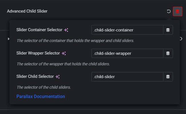
Please note that this is a quite complex and experimental feature only for advanced users. The process may require additional CSS adjustments and modifications to the HTML structure, particularly to address elements generated by Elementor widgets and containers.
Gloo’s Slider Power opens up the possibilities for what was previously a very basic feature in any website. Just about every website has a slider somewhere, be it in the hero section, for testimonials, blog articles, and a myriad of other use cases. Now, all of these use cases won’t be limited to a single image or widget per slide. Elementor’s full editing potential is unlocked inside each singe slide!


